The Pride Marathon is a hybrid event created to help LGBTQ organizations raise money and awareness for LGBTQ+ mental and physical health challenges.
When I worked for the Banff Marathon as Communications Director in 2015 I saw firsthand how unifying and inspiring marathons can be. The Pride Marathon is designed to encourage personal wellness and community connections.
Scope
- Branding
- UX Research
- Event design
- Service design
- UI Design
Tools I used

NN/g UX
Training & Research
Illustrator
Brand design
Photoshop
Photo editing
InDesign
Report layout
Premiere Pro
Video production
Figma
App design
Creating a meaningful brand mark
The Pride Marathon brand needed to carry historical, emotional, and political weight while still feeling energetic and forward-moving. I began by researching symbols with deep roots in LGBTQ+ history.
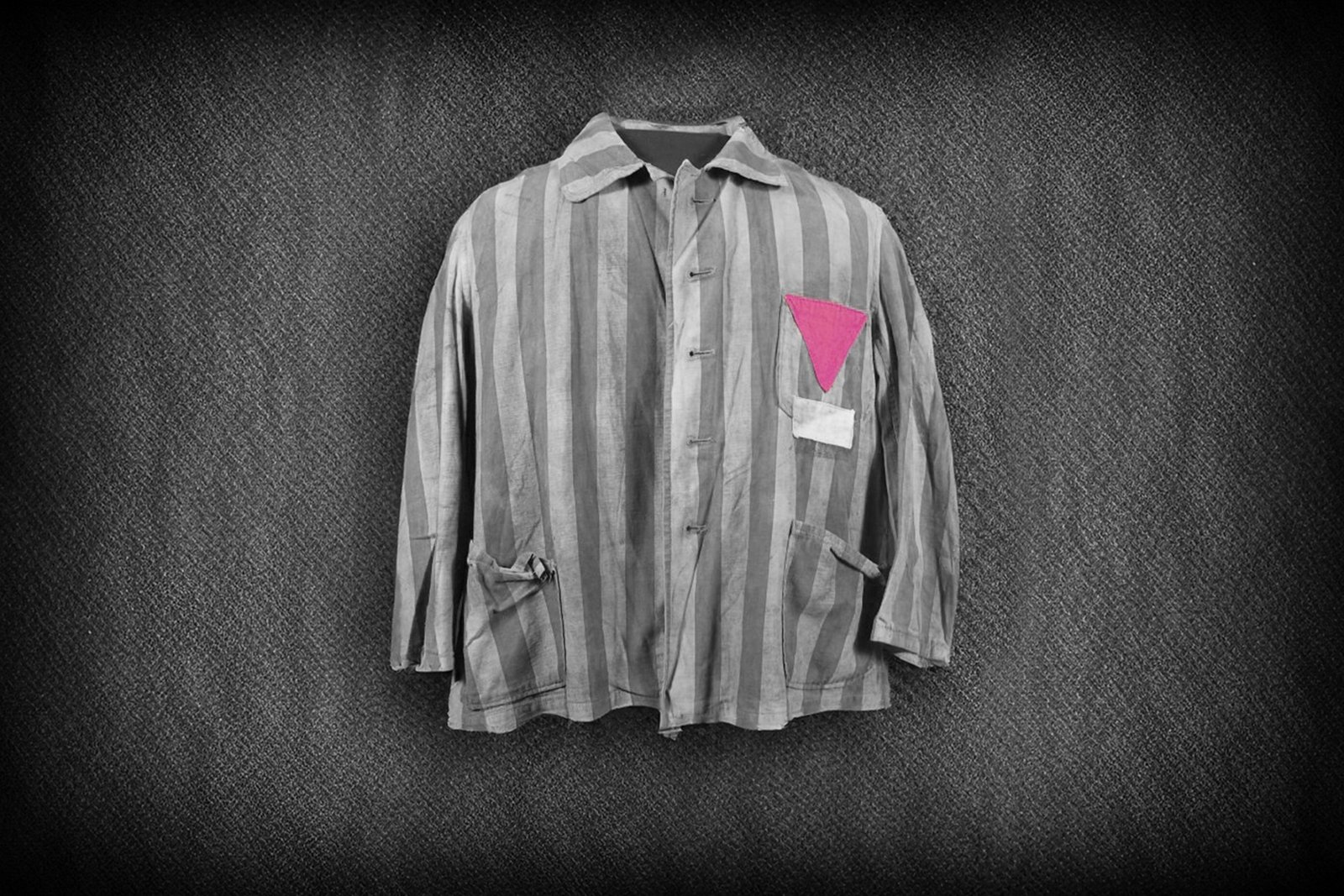
The pink triangle was initially a symbol of hate: it was devised by the Nazis to identify homosexuals as dangerously non-conformist enemies of the state. It has since been reclaimed by LGBTQ+ rights groups.
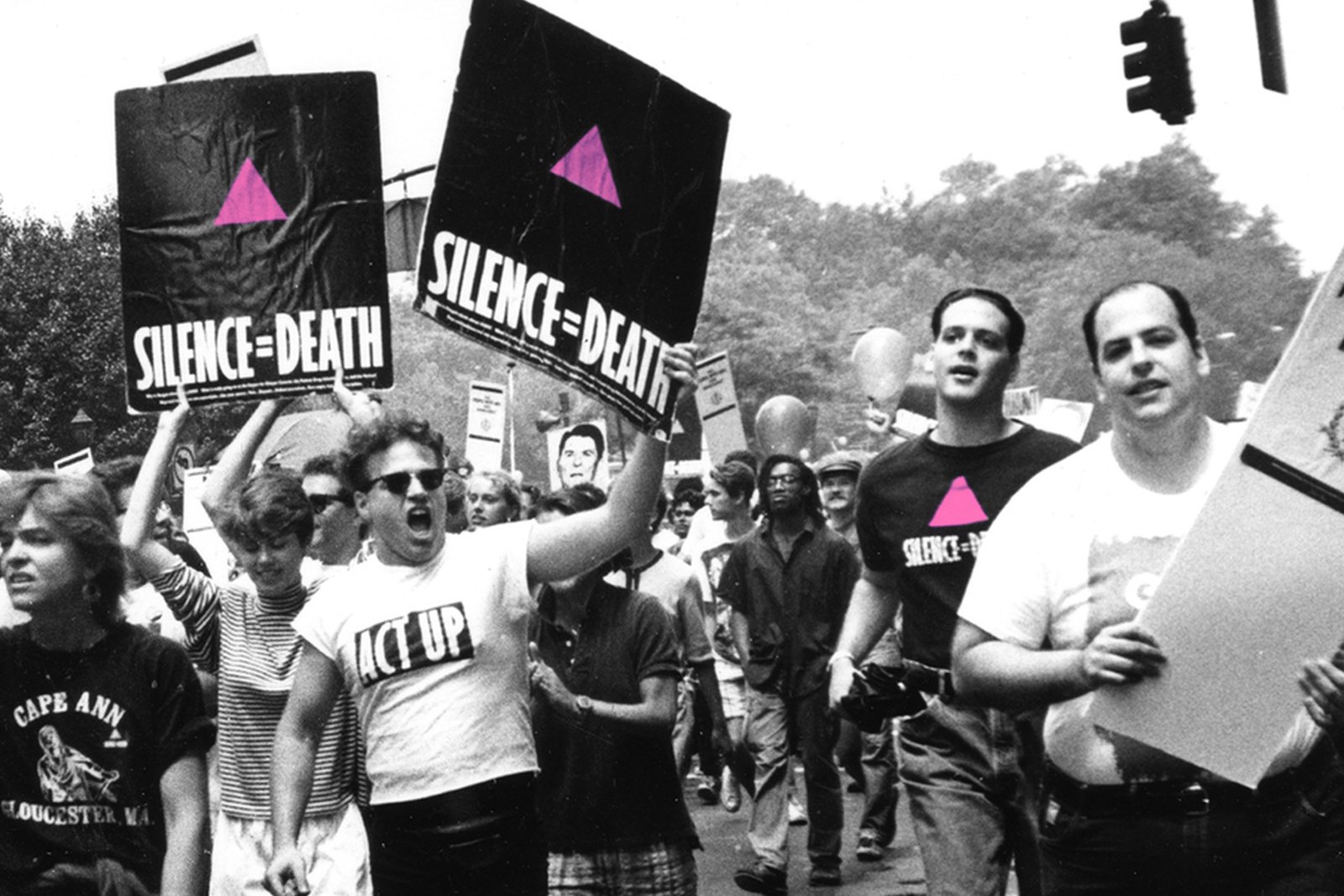
The pink triangle was reclaimed and reimagined by ACT UP, flipping the pink triangle with the solid base at the bottom and pointing up not down. It has now been adopted more widely to represent the LGBTQ+ community as a whole.
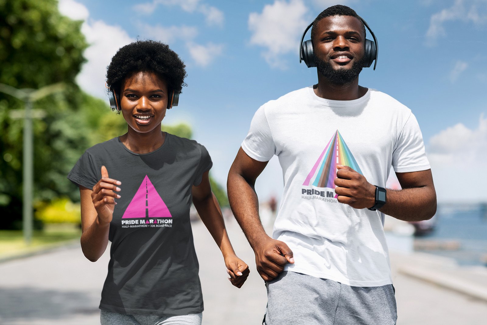
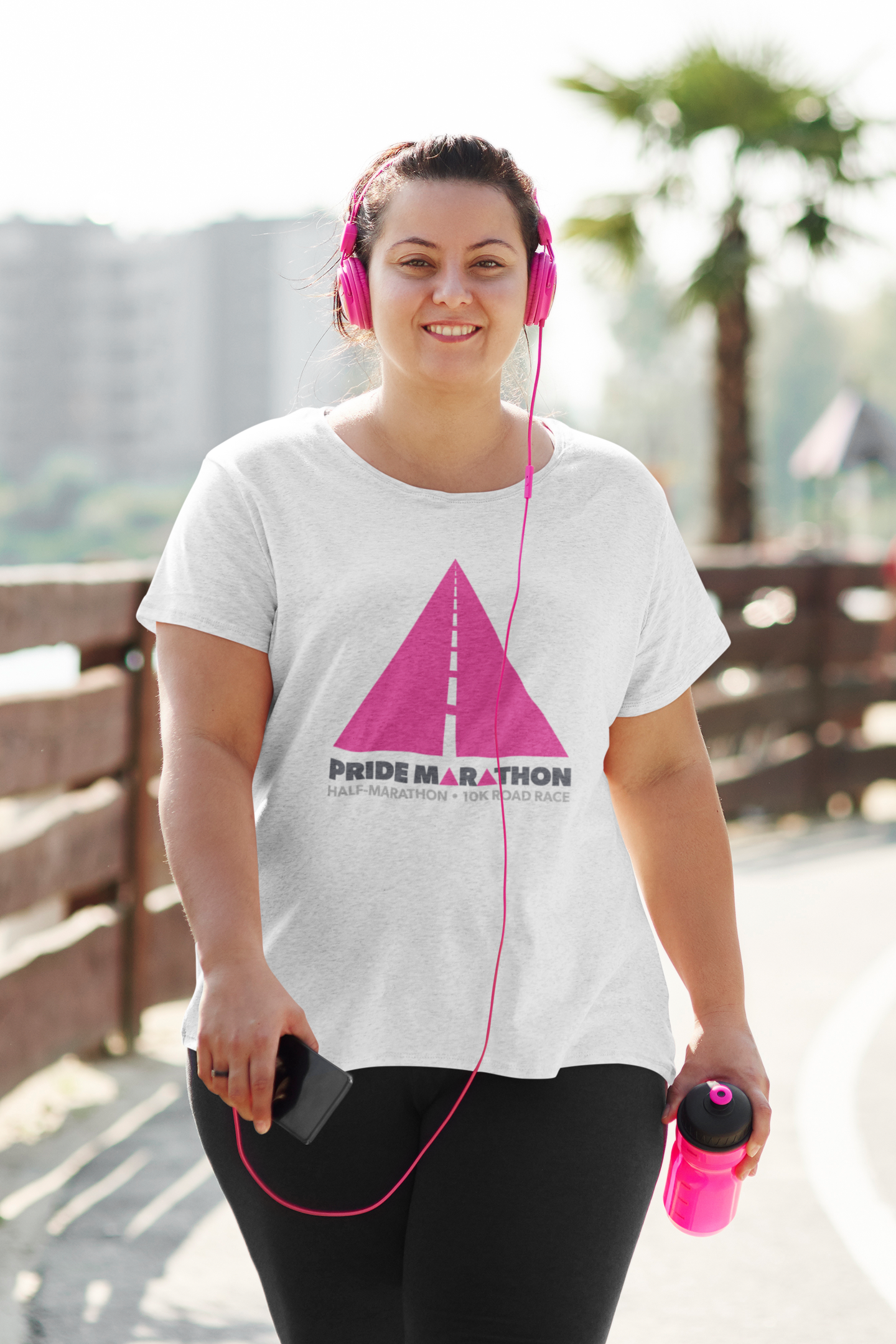
The Pride Marathon branding is based on the pink triangle. The added road markers are widely understood to signify a road, creating the overall impression of collective movement or a journey.
#FC008A
#1C1C1C
#e7e7e7
An event that is centred on inclusivity and accessibility must have a brand typeface that is first and foremost easy to read. Lexend is an open-source font developed by Google and Dr. Bonnie Shaver-Troup. It is one of the most legible typefaces ever developed.
Lexend
Aa
A B C D E F G H I J K L M N O P Q R S T U V W X Y Z
a b c d e f g h i j k l m n o p q r s t u v w x y z
Pride Marathon event design
The Pride Marathon was originally conceived as a hybrid event, offering at least one option for an in-person marathon (hosted in a city capable of providing the highest level of safety and security for participants), a virtual marathon (with a closed intranet-esque training and community app for participants), and a documentary showing the making of the event and the training journey of a diverse cast of participants.
In-person marathon
Virtual Marathon
Marathon documentary
UX Research Plan
Surveys
The first phase of research consisted of online surveys: a survey of Queer social media users and a survey of Queer fitness app users. We asked participants which apps they use and why, and if there are any apps they avoid and why. We also asked which functions they would like to see in an app, and if there are any features they specifically avoid. This final question turned out to be incredibly valuable...
Interviews
We conducted semi-structured interviews with experienced Queer runners to get their perspective on what would make a training app accessible and safe for queer runners. Key takeaways were the importance of letting runners register (for the app and for races) with their chosen name, and providing a wide range of sex categories beyond male and female.
Diary Studies
Next we will use diary studies to collect qualitative data about user behaviors and experiences over time. This will give us a nuanced sense of the habits and needs of our target market. This information will be used to fine-tune the design and functionality of the app.
Wireframes
Incorporating data from surveys and interviews, I collaborated with the design lead to create wireframes of the app to accurately reflect the proposed information architecture of the site. The feedback from SMEs (Queer runners) was especially useful in thinking through the design of the app.
Usability testing
After prototypes of the app are created the next step will be remote usability testing. Participants will be selected based on specific demographic criteria. We want to be sure to include both experienced runners and new runners, as well as runners with disabilities. They will be asked to perform specific functions in the app without instructions.
A/B Testing
Based on survey data, designers determined that real-world mapping would be opt-in only. In lieu of real-world mapping we have developed two alternatives. Once the app is up and running we'll conduct A/B studies to determine whether users prefer the de-identified mapping function (a squiggle on a solid background) or whether they prefer the image-matched version (a squiggle superimposed on an AI generated art image).
Safety first
Design and functionality based on user experience surveys of LGBTQ+ people with varied athletic backgrounds revealed that safety, workout accountability, and community building were the top priorities for a queer social fitness app.
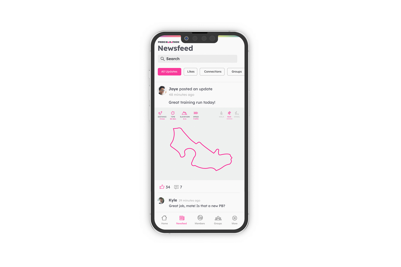
Anonymity
Participants are encouraged to use single names or nicknames.
Brag safely
Show your runs, but hide geographic identifying information.
Walk, run, wheel
Participants can log walking, running, and wheeling workouts.
Best of both worlds
A social app and a training app all in one.
Mobile-first user interface


")


