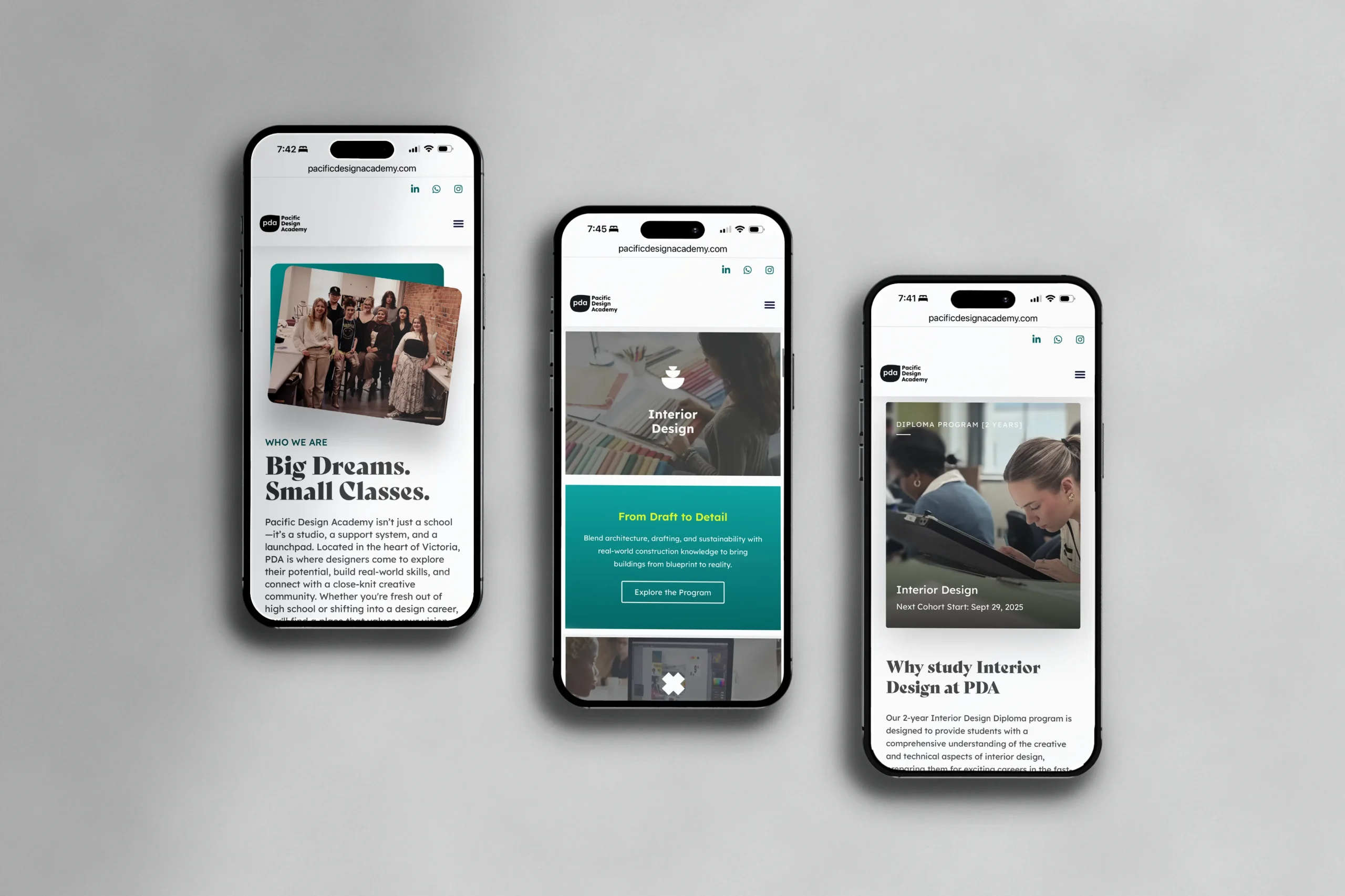
In 2025, I led a full rebrand of Pacific Design Academy, a small art and design college in Victoria, BC. The goal was to reposition PDA as a contemporary creative school preparing students for real careers, with the new brand live before peak summer recruitment.
I started with primary research: interviews and surveys with students and faculty across Fashion, Interior, and Graphic Design. What they described — a close-knit community, working-professional instructors, a cohort model — became the brand’s three pillars.
Scope
- Market research
- User interviews
- User testing
- Persona development
- Recruitment strategy
- Messaging framework
- Brand revision
- Typography & colour systems
- Custom iconography
- Photography & videography
- Print & environmental design
- New WordPress build

Tools I used

NN/g
Research

Figma
UI

Wordpress
(Elementor)

Canon
R50

Adobe
Illustrator

Premiere
Pro
Project Deliverables.
VISUAL IDENTITY
Familiar, but Fresher
Rather than replace the existing PDA logo and colour palette, the refresh focused on refinement—preserving brand recognition while improving usability and cohesion. The updated palette enhances contrast and accessibility across digital and print applications. Minor adjustments to spacing and application of the logo help it perform more consistently across platforms, while supporting a more contemporary visual language that aligns with the updated brand voice.
Bely Display
A B C D E F G H I J K L M N O P Q R S T U V W X Y Z
a b c d e f g h i j k l m n o p q r s t u v w x y z
1 2 3 4 5 6 7 8 9 % & *
Lexend Deca
A B C D E F G H I J K L M N O P Q R S T U V W X Y Z
a b c d e f g h i j k l m n o p q r s t u v w x y z
1 2 3 4 5 6 7 8 9 % & *
TYPOGRAPHY
Form and Function
The PDA rebrand uses two typefaces that embody the school’s values of creativity and clarity. Bely, designed by Roxane Gataud as a student project, adds expressive flair to display moments. Lexend, created by Dr. Thomas Jockin and Dr. Bonnie Shaver-Troup, was developed to improve reading fluency and reduce visual stress. Together, they strike a balance between form and function—artful, accessible, and human-centered.
CUSTOM ICONOGRAPHY
Bauhaus-Inspired Icons
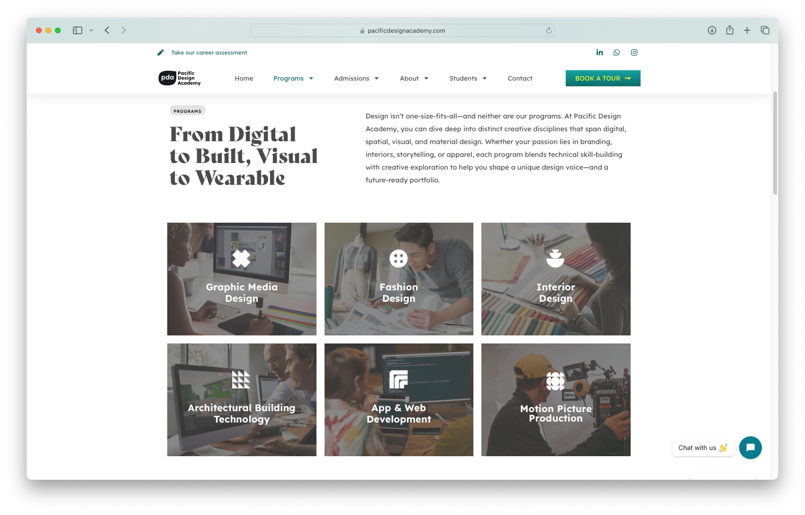
As part of the rebrand, I designed a custom set of geometric icons inspired by Bauhaus principles. Each icon represents a PDA department or core value, creating a modular visual system that’s both functional and expressive.
PHOTOGRAPHY & VIDEO
Capturing the story of PDA
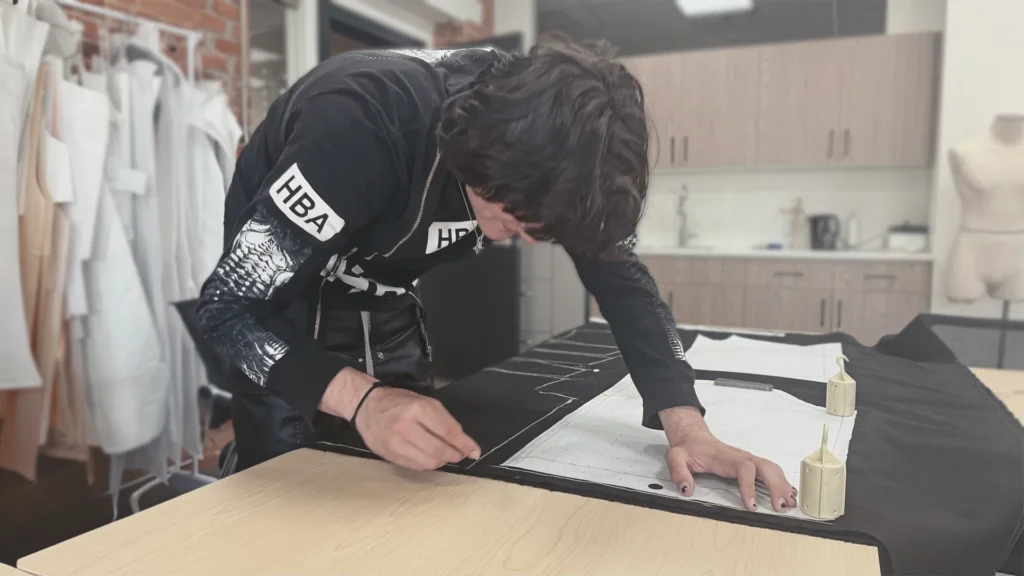
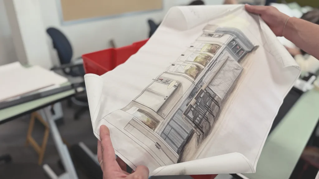
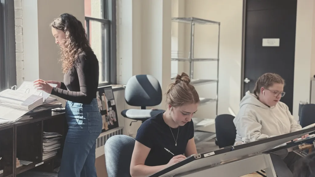
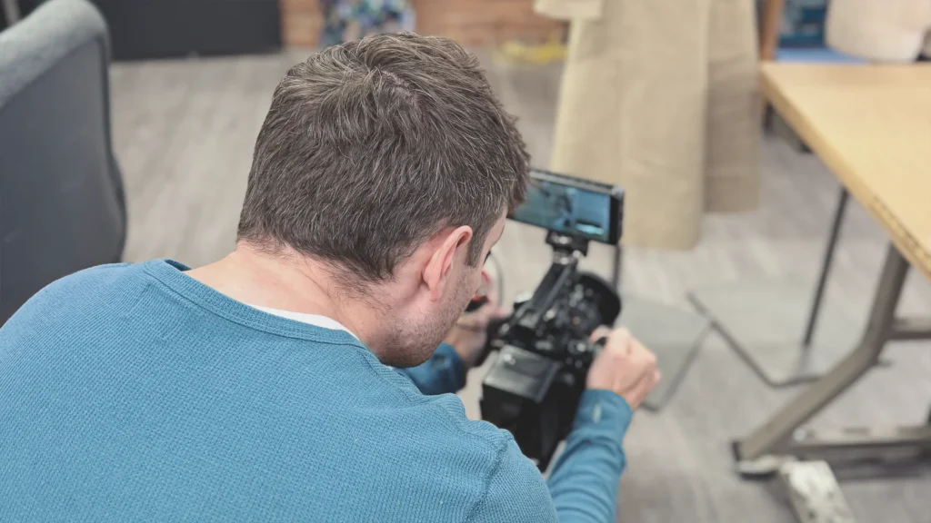
To support the rebrand and strengthen recruitment, I built a robust image and video library capturing the real day-to-day experience at PDA. Using a Canon R50 and iPhone 16 Pro Max, I directed and shot content that highlights student collaboration, hands-on learning, and the school’s studio culture. The result is a versatile media bank—authentic, human-centered, and aligned with the brand’s focus on creativity, community, and career-building.
2025 Graduating Fashion Show program
Project Update
Enrolment rose 27% following the launch. The school received an acquisition offer soon after, and the sale was finalized in July 2026. The new ownership has since moved to their own identity but retained most of what I built: the site structure, the content framework, and the photography and video library.