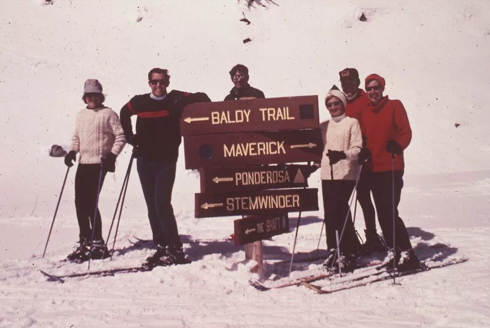
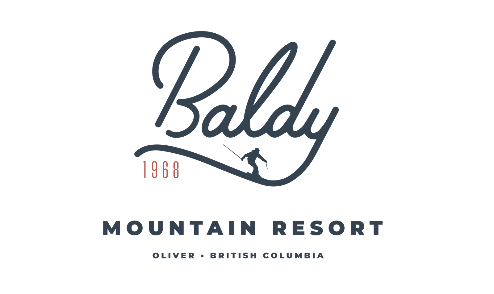
Baldy Mountain Resort opened for the 1968-69 season, with the McKinney T-bar and beginners rope tow operating. There were snowcat rides to the top on Sunday afternoons – $1.00 per ride.
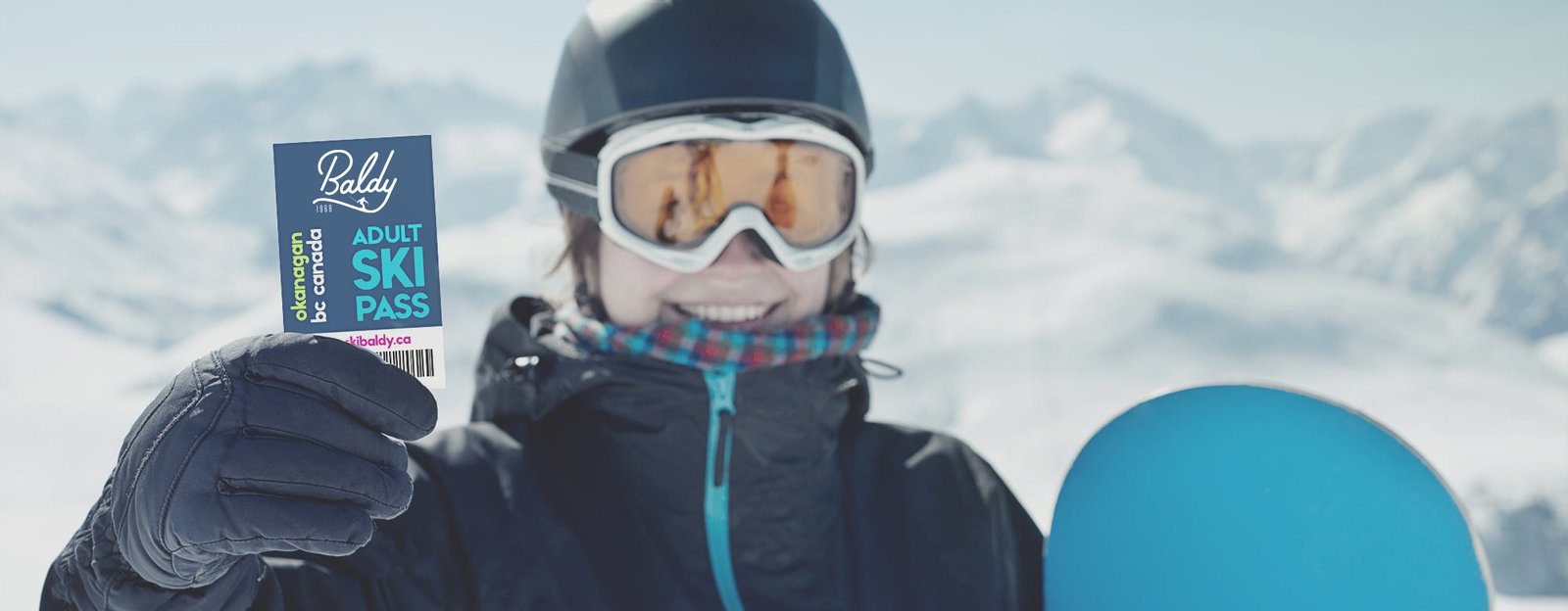
In 2016, a new group of investors came together to revitalize the formerly family-run resort. I was commissioned to design branding in a style that would highlight the resort’s historical roots.
Scope
- Market research
- User interviews
- User testing
- Logo design
- Brand guide design


A mid-century modern approach
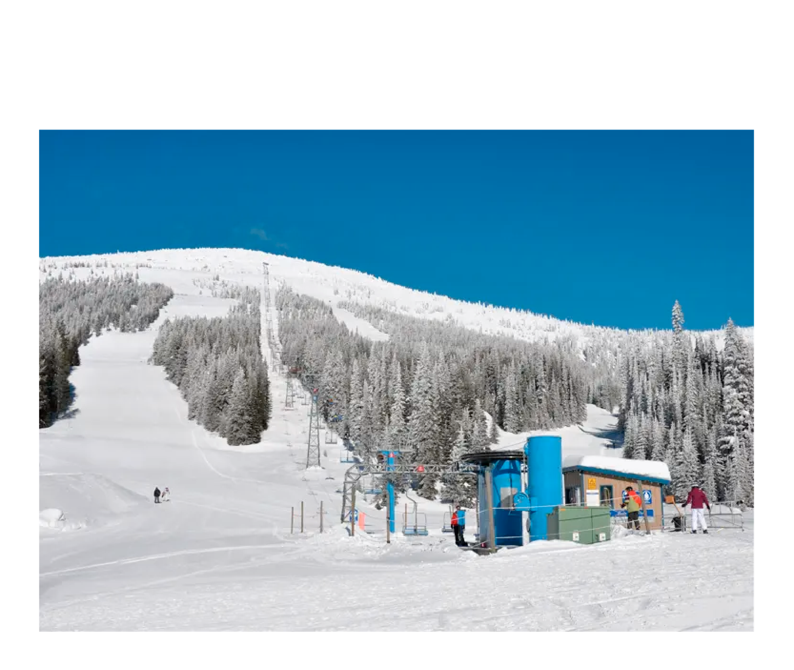
Because Baldy couldn’t compete with the modern infrastructure of other big BC ski resorts, it was important that the branding reflected what Baldy’s origins and the appeal of no-nonsense fresh powder skiing. The first priority was creating a colour palette that was bright and fresh but still gave a nod to the past. Photos like these helped to create that colour palette.
#324E5C
#82CFDB
#D26056
#EFBA50
#e7e7e7
I wanted to keep typography simple and bold, so Montserrat was the font chosen after user-testing proved it to be the most impactful and legible. Using an open-source font was also a priority, as the new ownership was prioritizing funding renovations of the resort itself.
Montserrat
Aa
A B C D E F G H I J K L M N O P Q R S T U V W X Y Z
a b c d e f g h i j k l m n o p q r s t u v w x y z
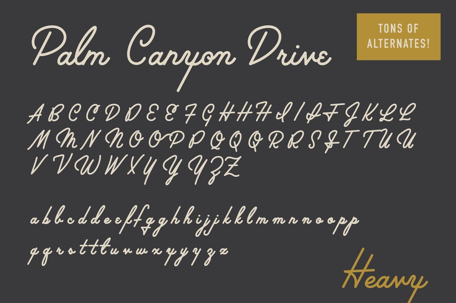

The right typeface for the brand
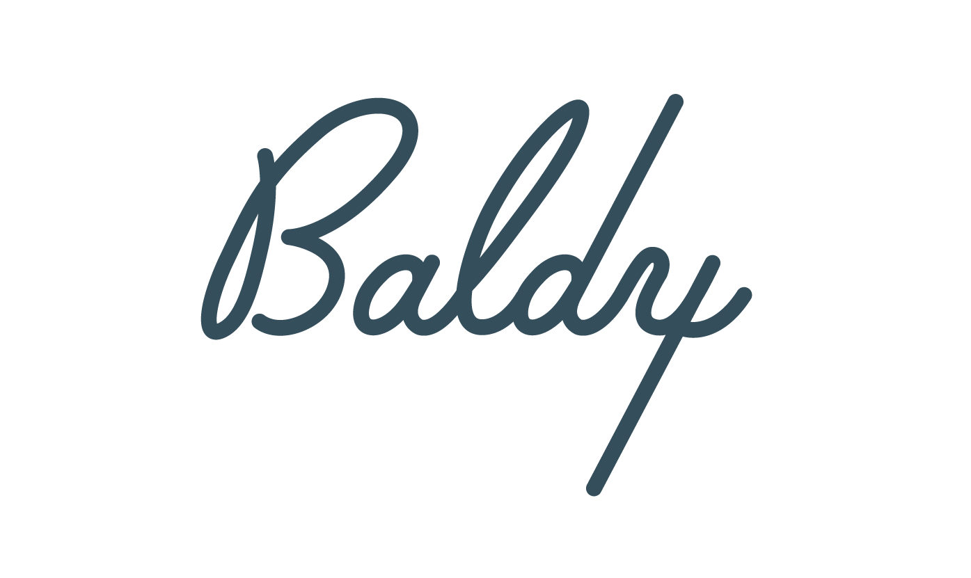
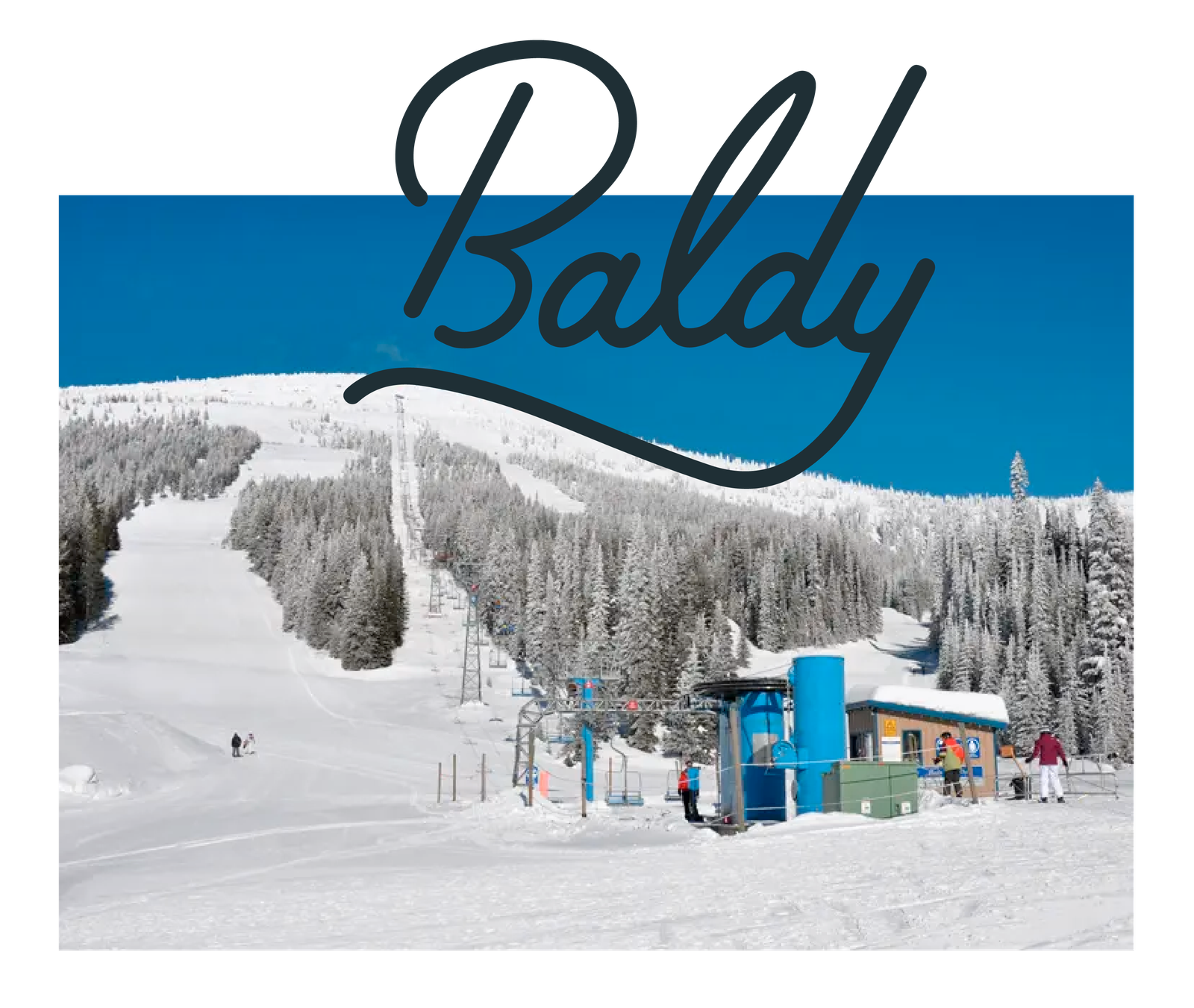
The most important element of the brand mark was to get exactly the right font. While the final product required some fun customization, Palm Canyon was the best typeface I found to convey the fun vintage-inspired vibe.
Close but not quite…
Racy Uppercase
User testing showed what I failed to see: an anatomically suggestive uppercase letter B
Boring Descender
The y at the end was too abrupt for a slope-based brand
Inspiration at hand
When experimenting with options for the “y” in Baldy, inspiration struck when looking at photos provided by the project manager. I wanted the descender (the bottom part of the lowercase “y”) to have a slope to it and what better slope than that of Baldy Mountain?
Coming together
The better B
A less suggestive and custom uppercase B
Slope style
The y descender became the slope of Baldy as seen from the chairlift line
Humble beginnings
Using the founding year in the logo gives context to the retro brand
Montserrat
The complimentary Monterrat pairs well with Palm Canyon