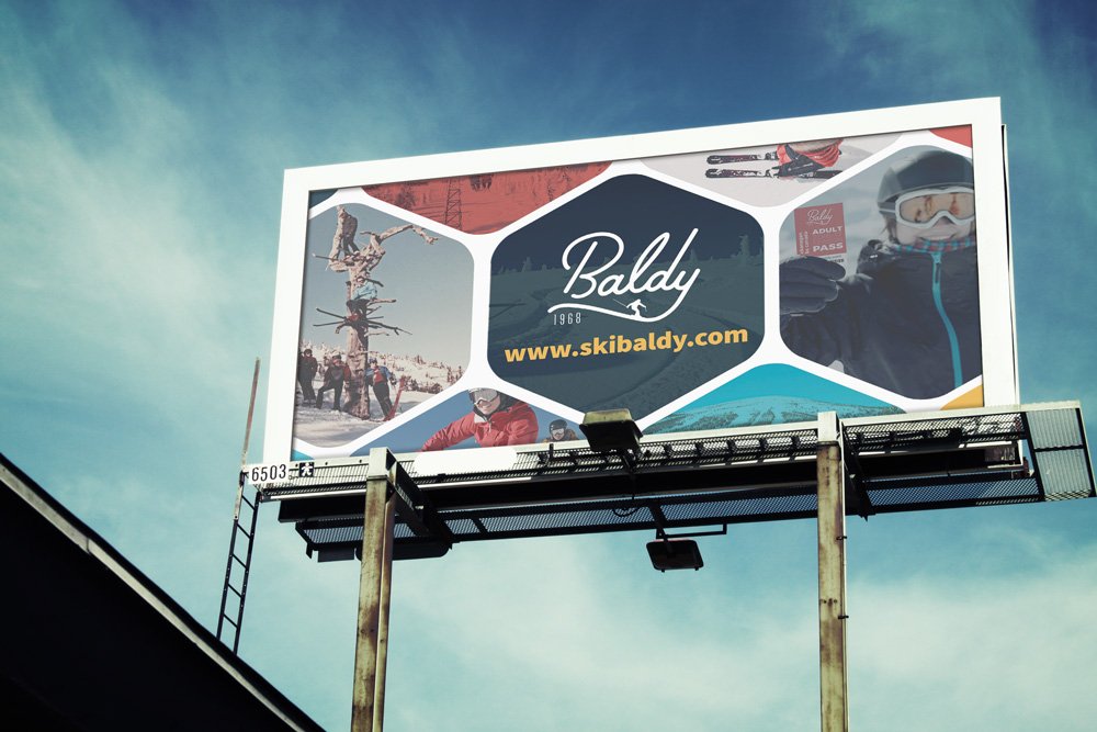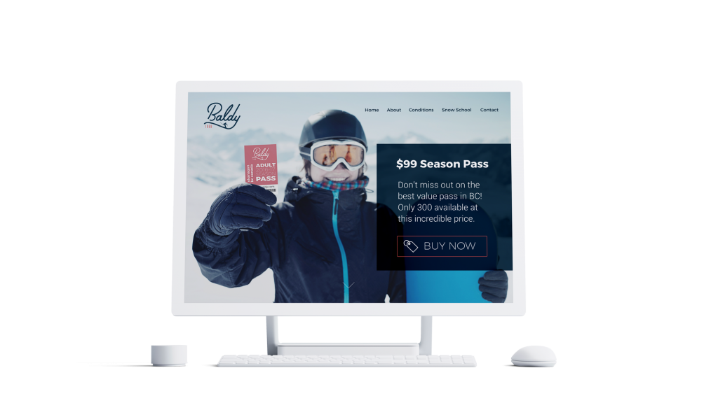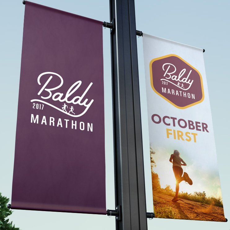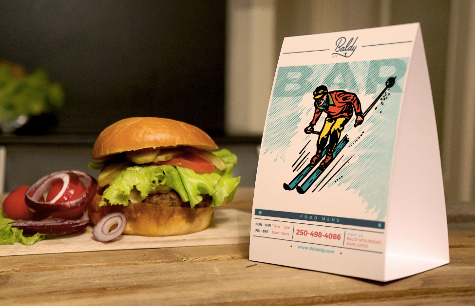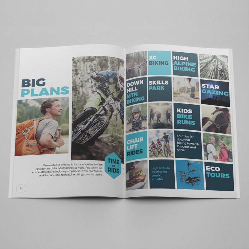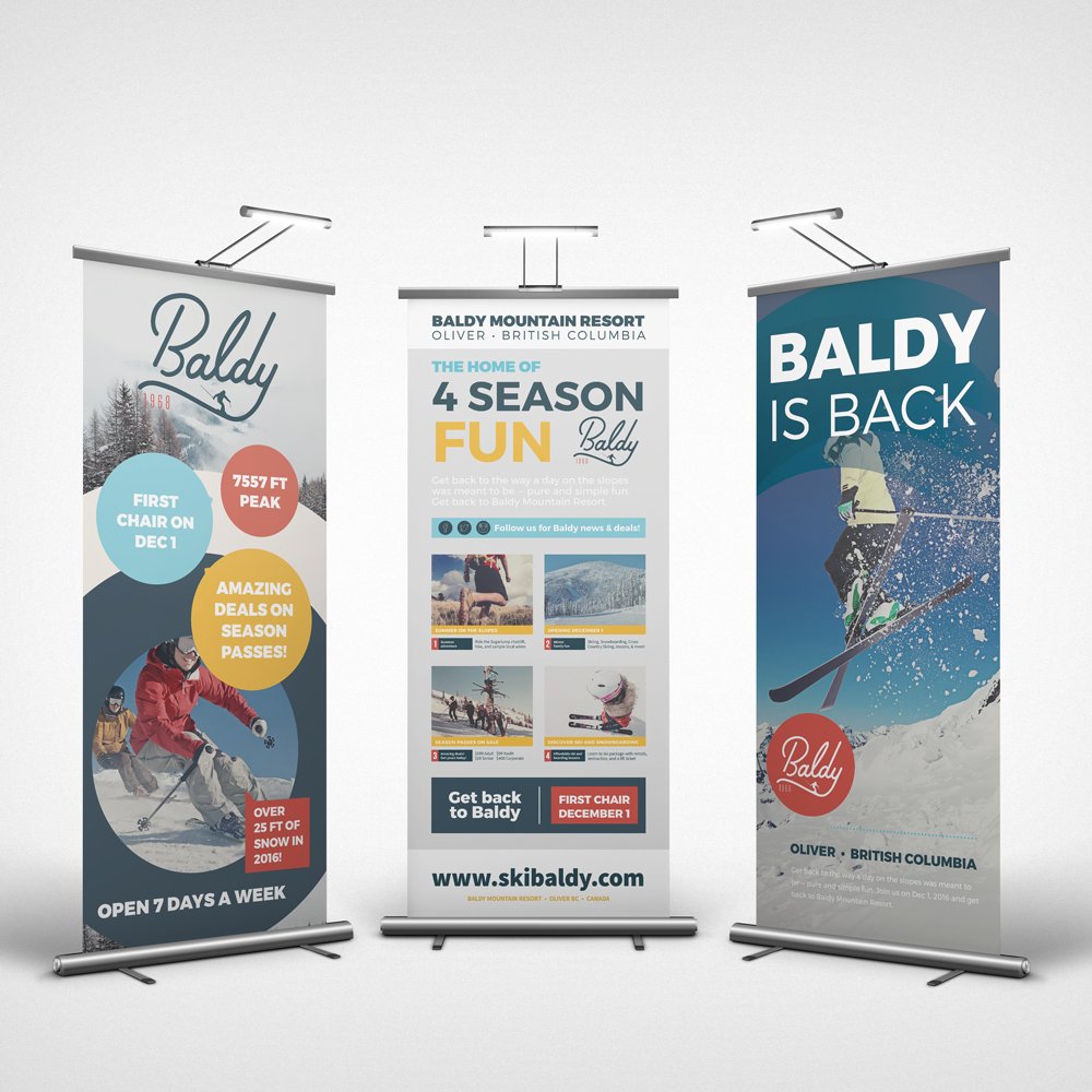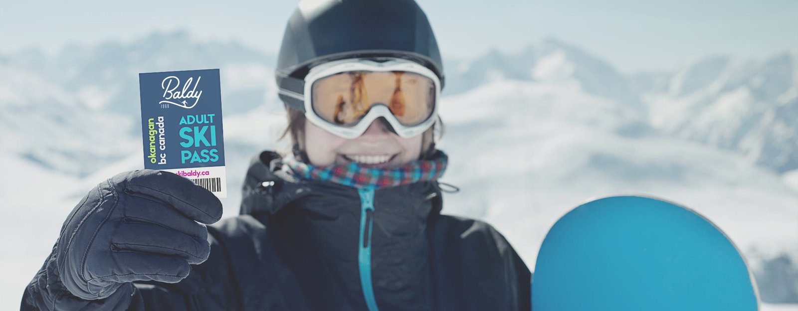
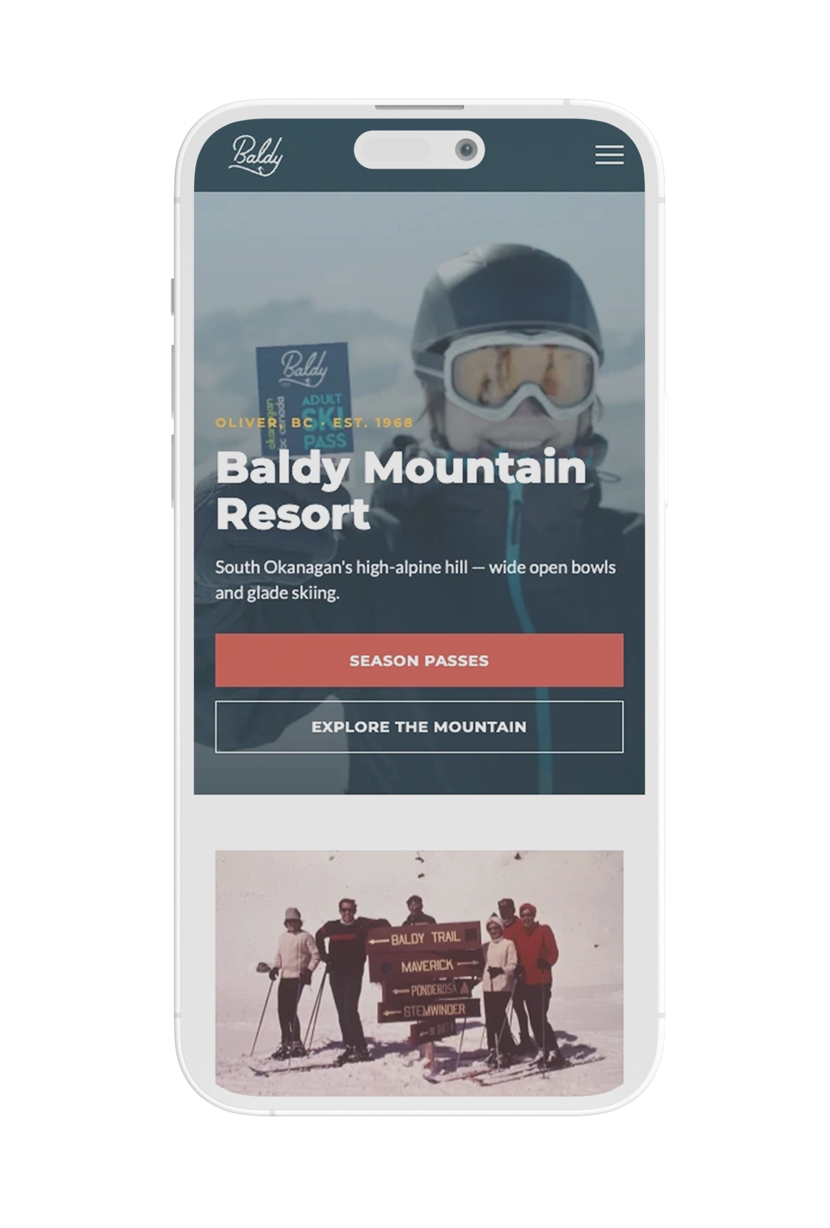
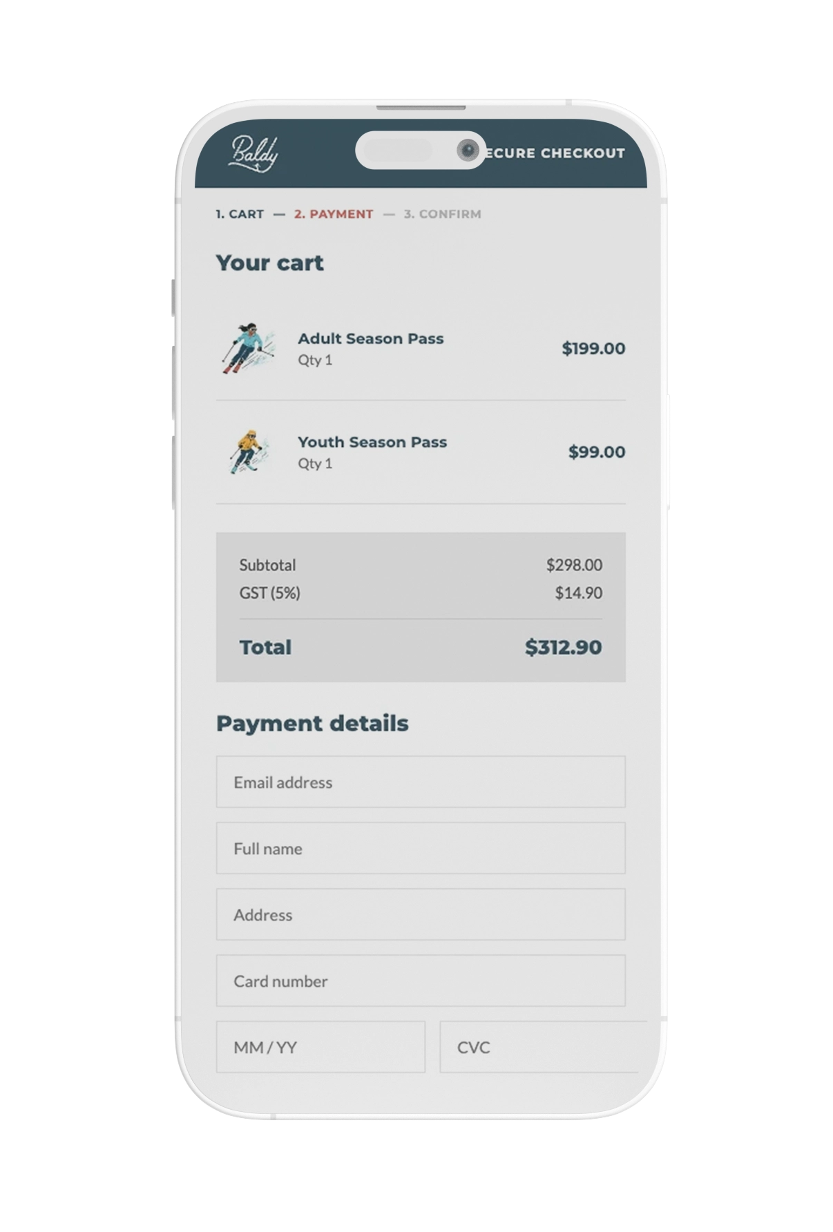
In June 2016, a new group of investors set out to revitalize Baldy Mountain Resort, a formerly family-run mountain that had operated since 1968. The season pass date was already fixed. I had five weeks to build a brand rooted in that history and get it selling.
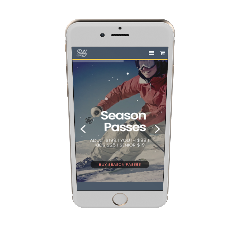
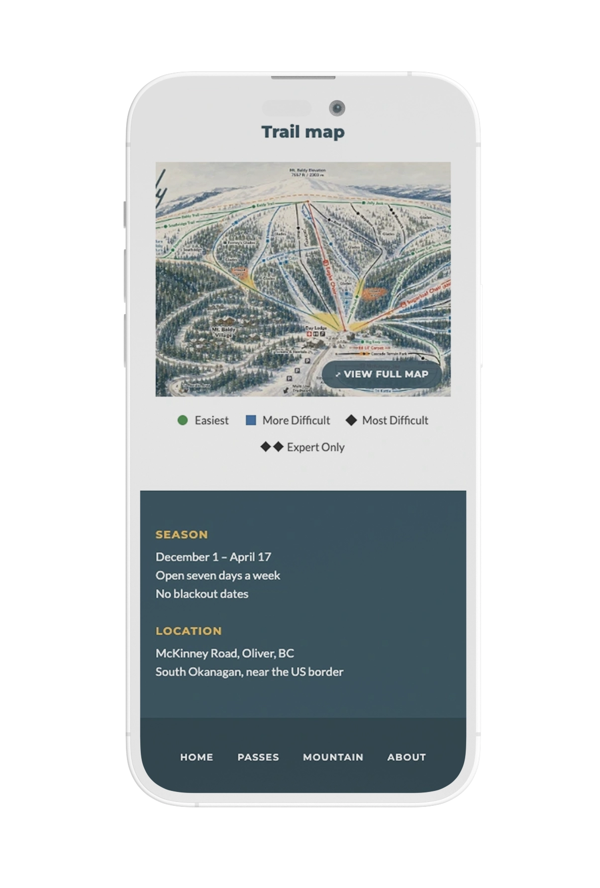
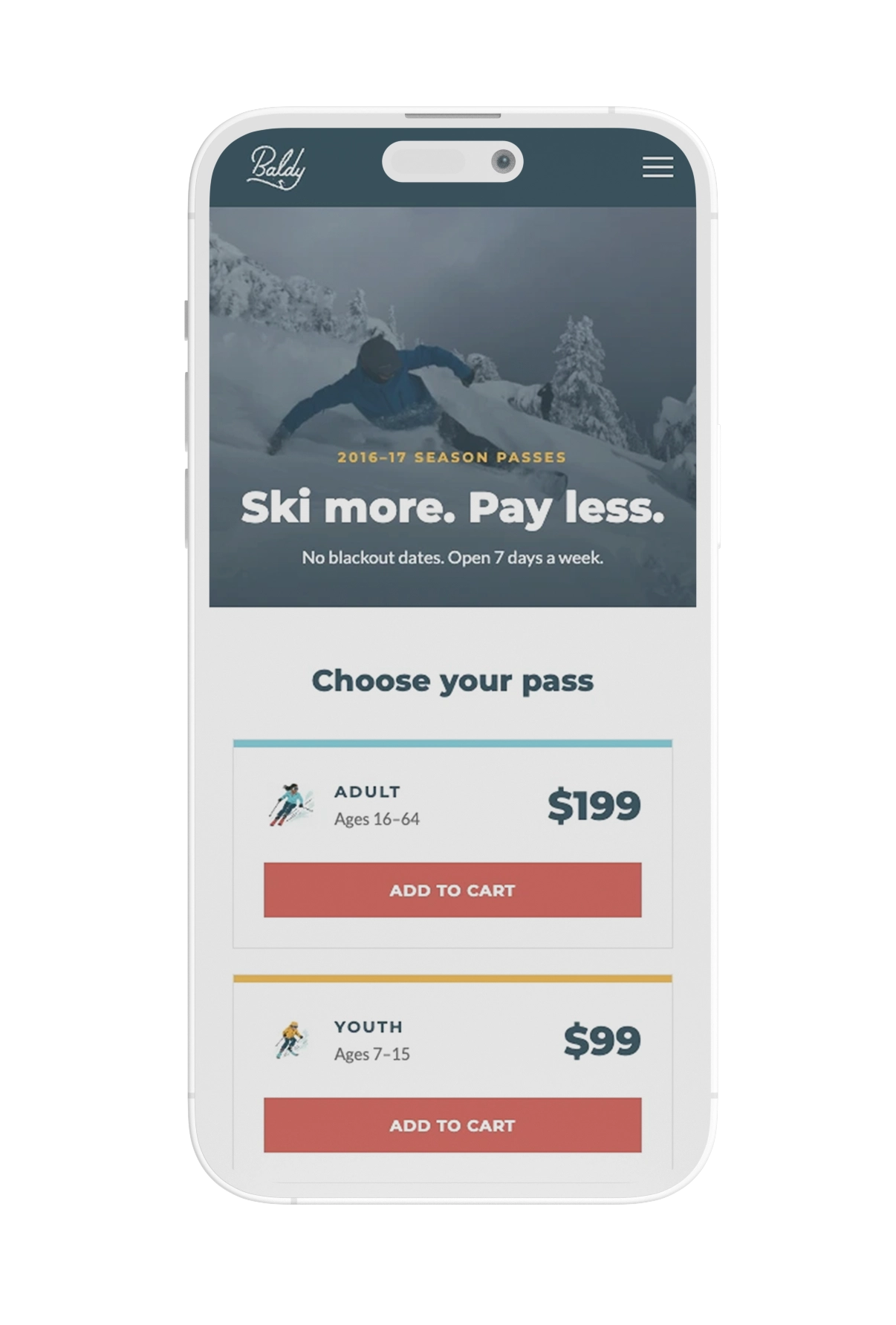
That meant a full visual identity, print and environmental materials, and a WordPress e-commerce site, delivered together. There was no soft launch, no phase two. Season passes went live on August 1 and the site took over $250,000 in sales that first day.
Scope
- Market research
- User interviews
- User testing
- Logo design
- Brand guide design
- Print & environmental design
- WordPress e-commerce site
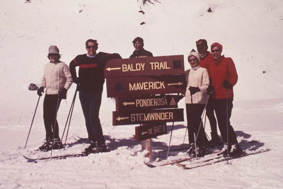
A mid-century modern approach
Baldy opened for the 1968-69 season with the McKinney T-bar, a beginners rope tow, and snowcat rides to the top on Sunday afternoons at a dollar a ride. That era is the resort’s real advantage, and photos like this one set the direction.
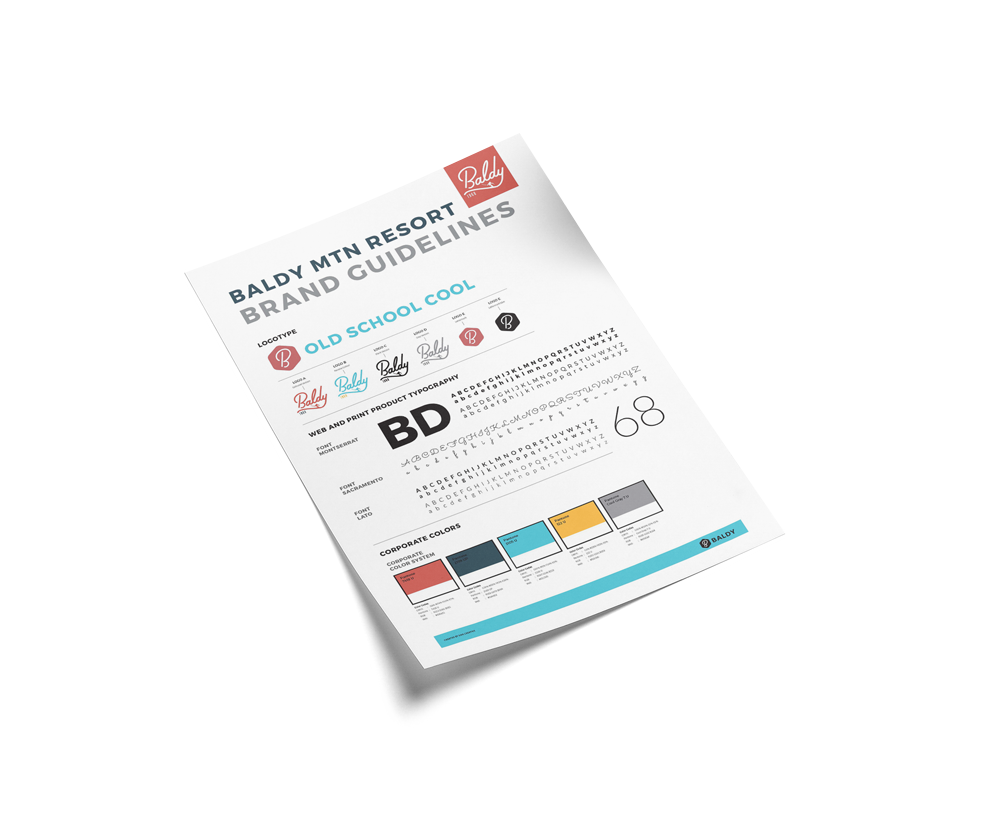
Baldy couldn’t compete with the modern infrastructure of the bigger BC resorts, so the brand had to lean on what it did have: its origins, and the appeal of no-nonsense fresh powder skiing. The first priority was a colour palette that felt bright and fresh while still nodding to the past.
#324E5C
#82CFDB
#D26056
#EFBA50
#e7e7e7
I wanted to keep typography simple and bold, so Montserrat was the font chosen after user-testing proved it to be the most impactful and legible. Using an open-source font was also a priority, as the new ownership was prioritizing funding renovations of the resort itself.
Montserrat
Aa
A B C D E F G H I J K L M N O P Q R S T U V W X Y Z
a b c d e f g h i j k l m n o p q r s t u v w x y z

The right typeface for the brand
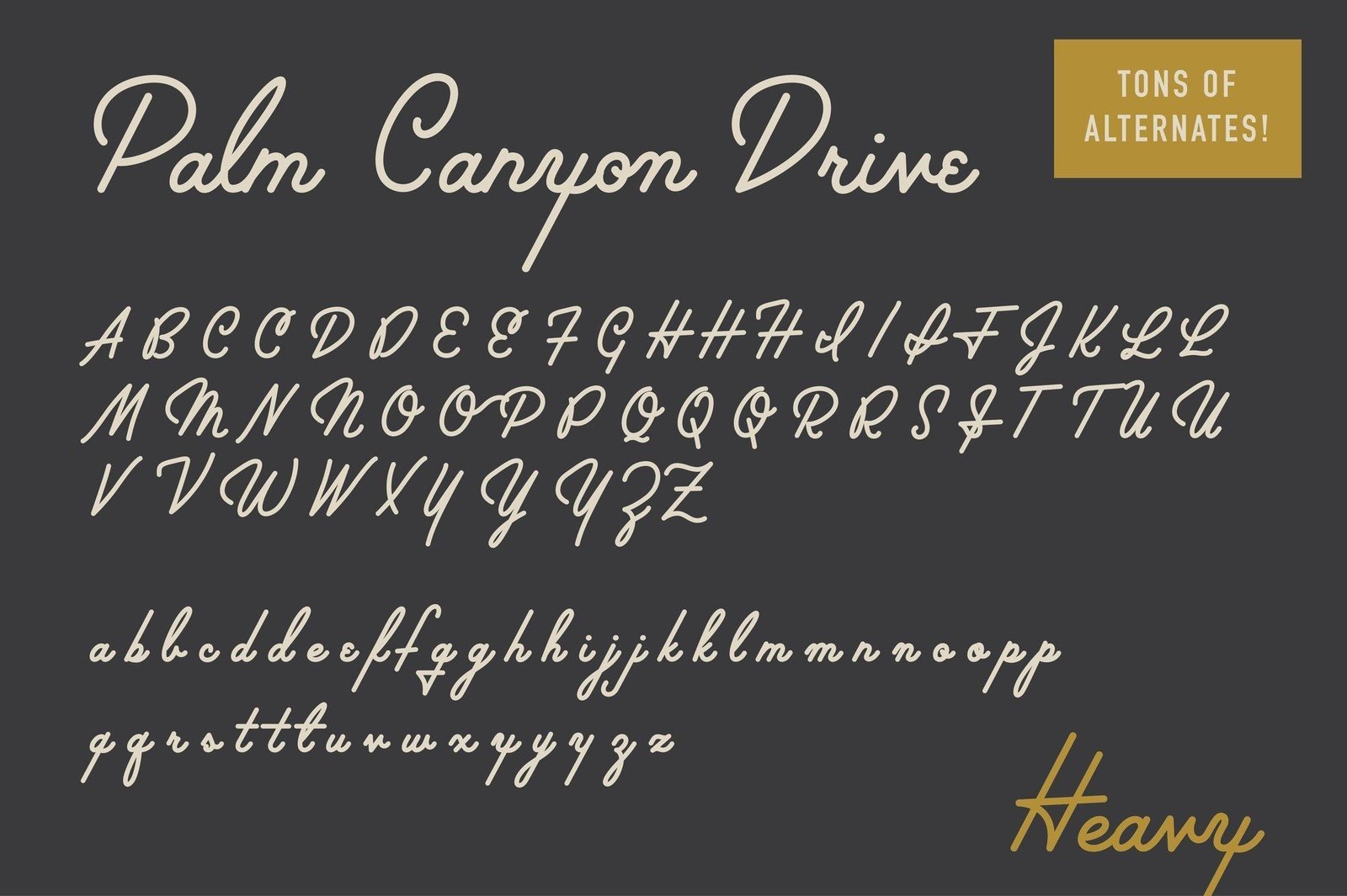
The most important element of the brand mark was to get exactly the right font. While the final product required some fun customization, Palm Canyon was the best typeface I found to convey the fun vintage-inspired vibe.
Close but not quite…
Racy Uppercase
User testing showed what I failed to see: an anatomically suggestive uppercase letter B
Boring Descender
Palm Canyon’s y ends on a blunt terminal. On a brand built around a mountain, the one stroke with room to describe a slope was doing nothing with it.
Inspiration at hand
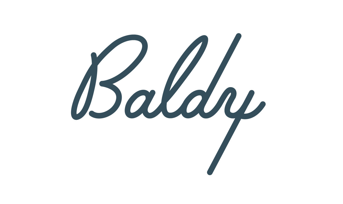
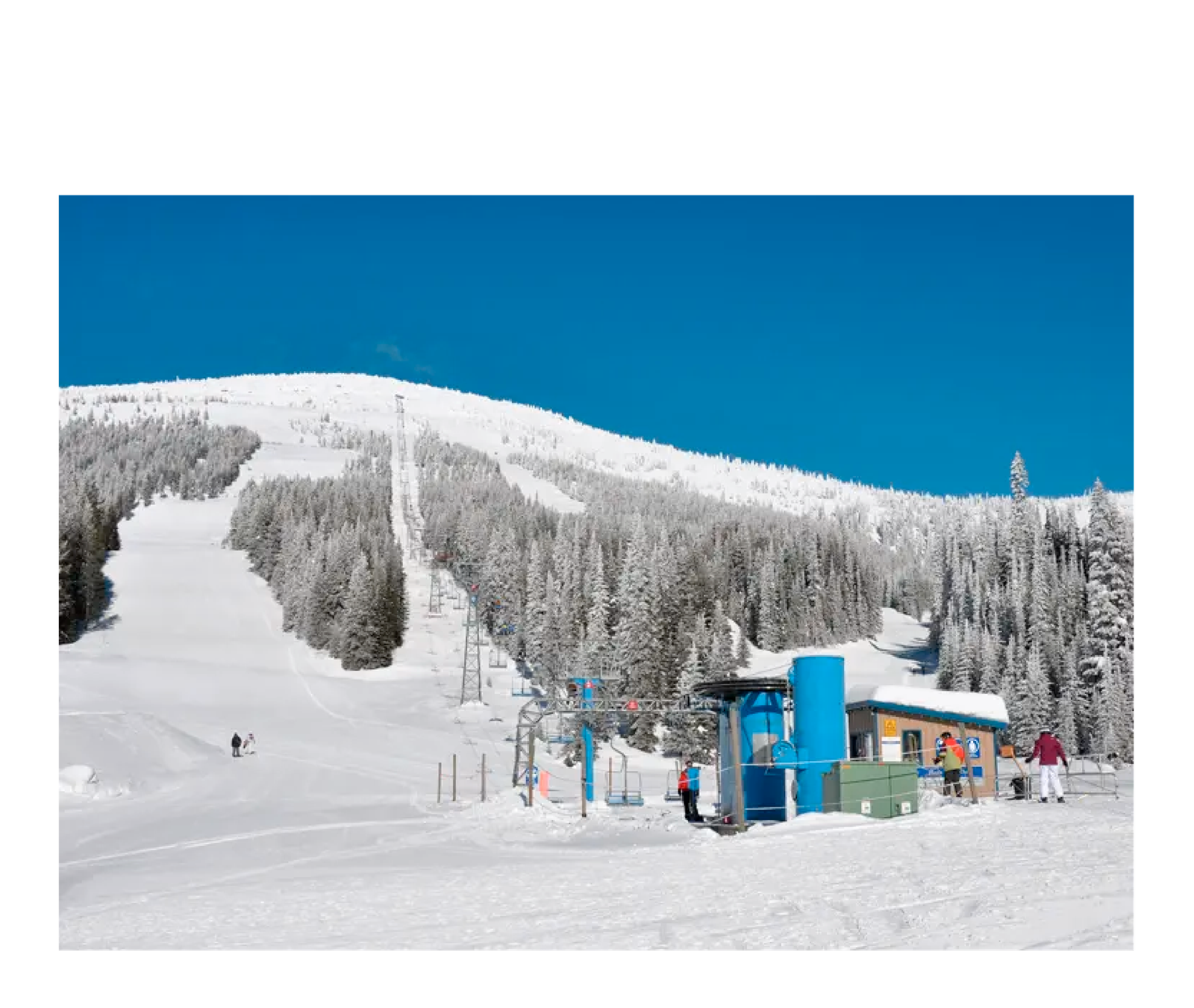
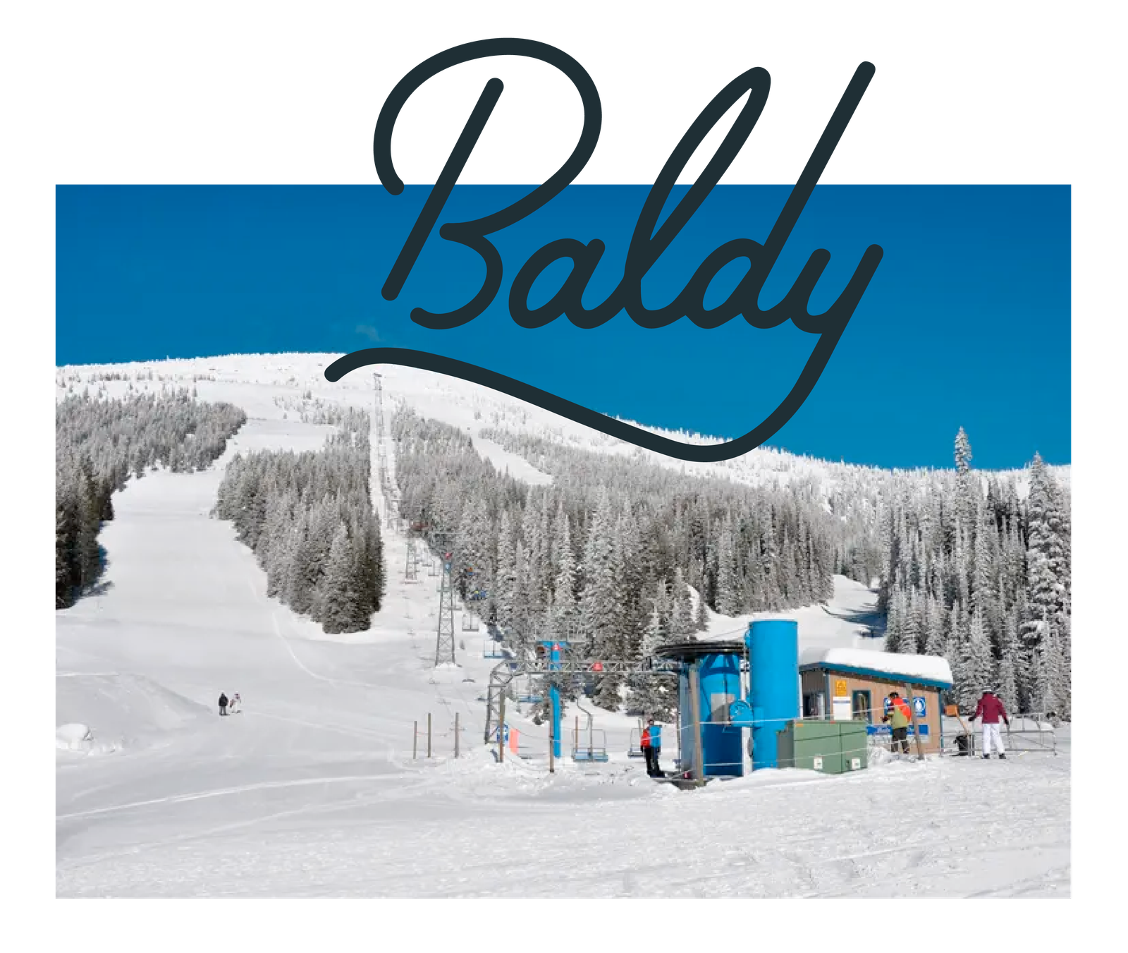
When experimenting with options for the “y” in Baldy, inspiration struck when looking at photos provided by the project manager. I wanted the descender (the bottom part of the lowercase “y”) to have a slope to it and what better slope than that of Baldy Mountain?
Coming together
The better B
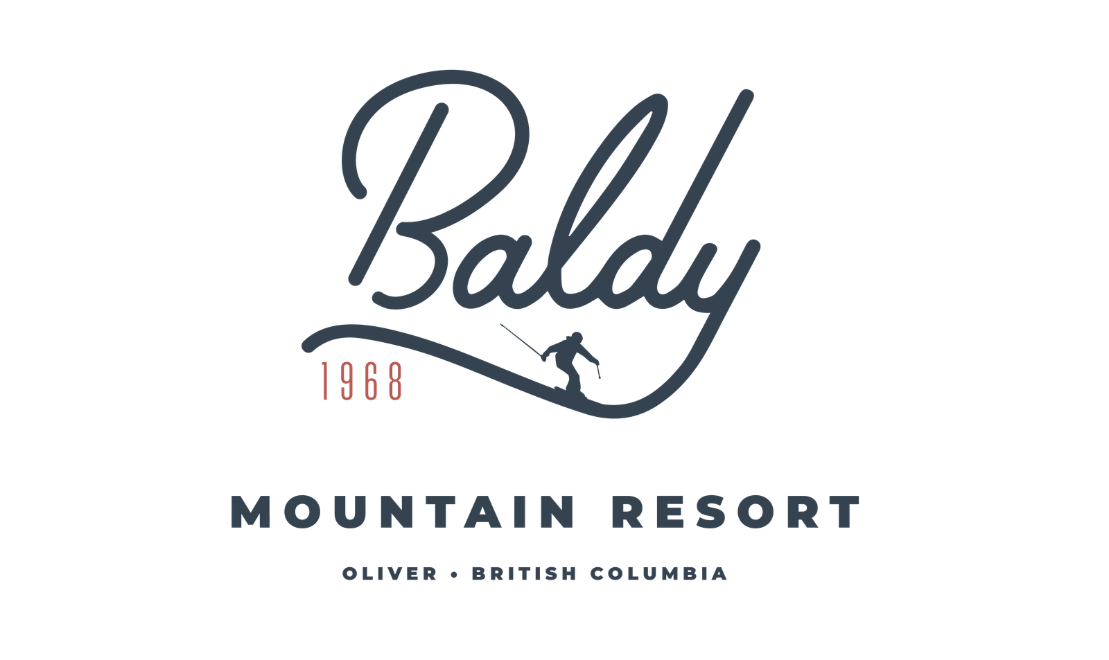
A less suggestive and custom uppercase B
Slope style
The y descender became the slope of Baldy as seen from the chairlift line
Humble beginnings
Using the founding year in the logo gives context to the retro brand
Montserrat
The complimentary Monterrat pairs well with Palm Canyon